Home of the Digital Architects
Branding & Website Redesign
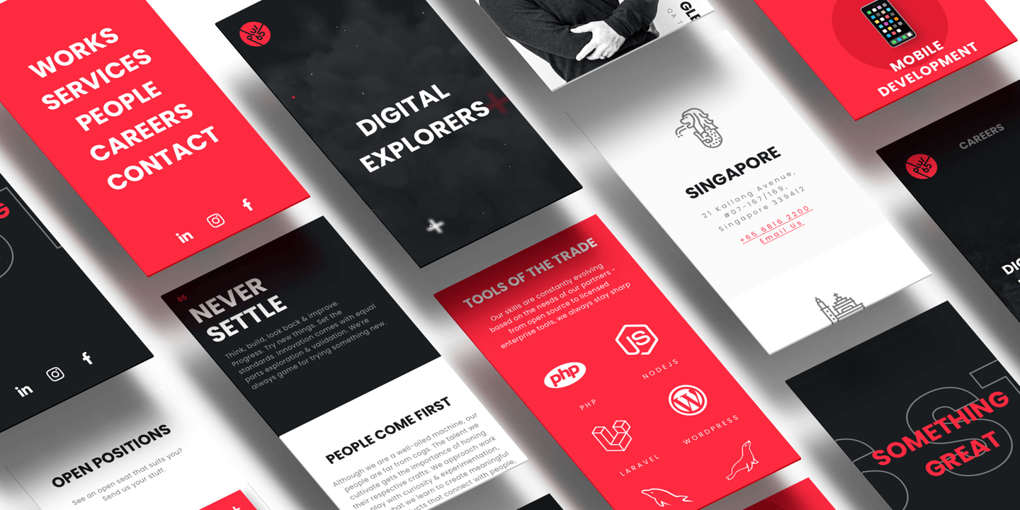
The site is an internal rebranding project for creating a minimalistic design and showing all the expertise in UI/UX and project experience we have acquired in recent years. We wanted to foster design thinking, attract talent, and showcase the amazing works of our design and engineering teams.
-
Client
Plus65 Interactive -
Our Role
+ Internal Rebranding + Brand Style Guide + Competitor Research & Analysis + User Experience Design + Information Architecture + CMS Integration + Web Design & Development
-
Industry
Digital Products & Services -
Technology
+ HTML / CSS / JavaScript + Bootstrap responsive framework + GSAP animation framework
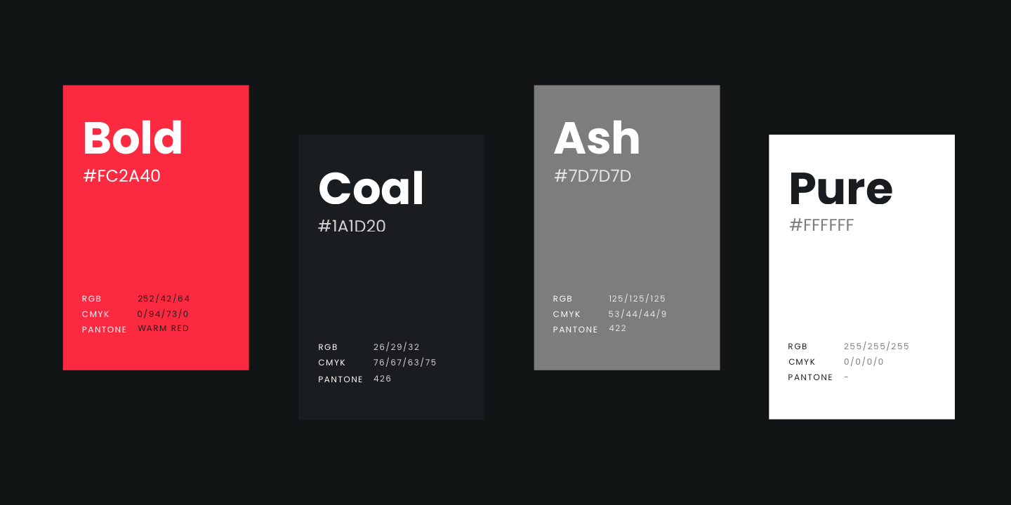
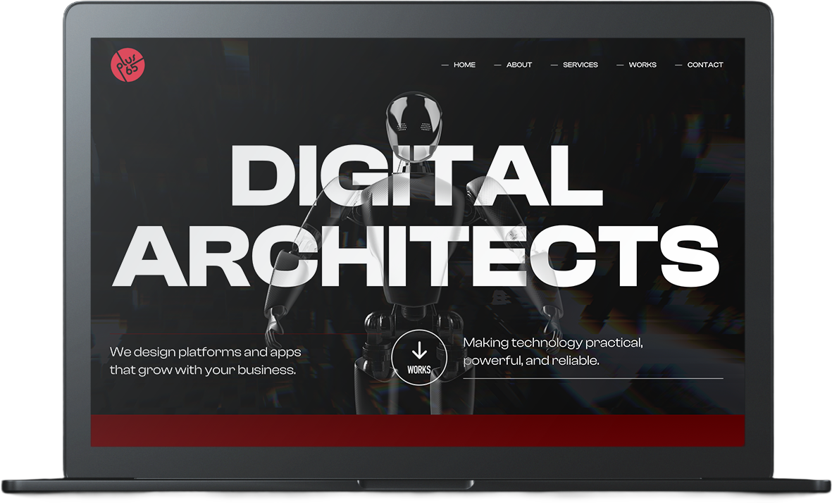
It’s time to be Bold
We are on a mission to create engaging brands, services & products through design & technology. In our new branding, we want to achieve a bold and dark theme, which inclines towards a more edgy look & feel.
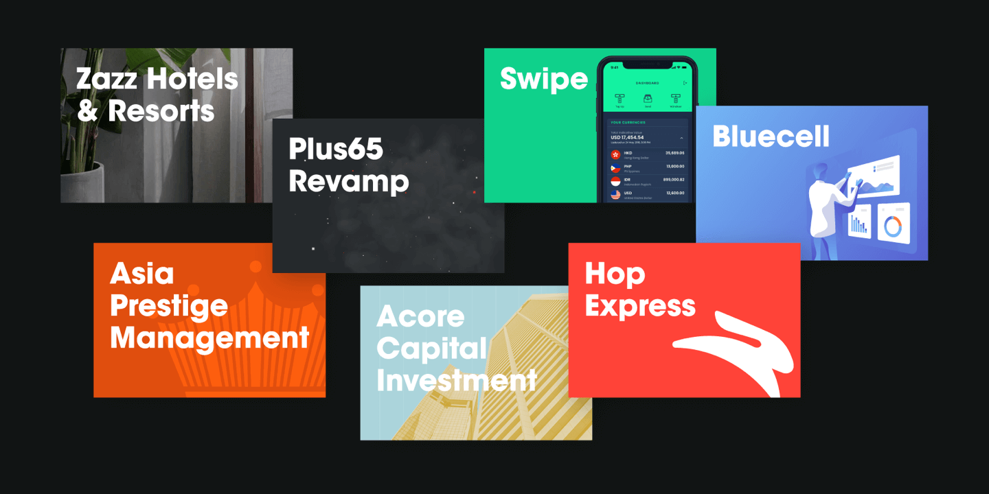
All of our project case studies are always about the product/brand. We created a system where all materials have the same rules for typography, yet they are distinguished from each other through visuals that let every project shine. Bright. Like a diamond.
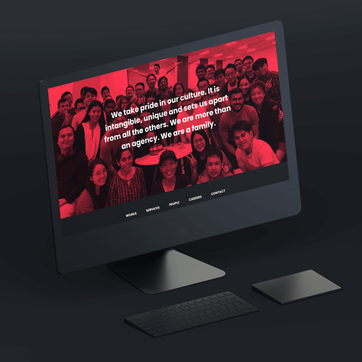
Super-Slick Website
As a fast-growing company, we wanted our website to be really simple & modular so that we would not be limited in adding or removing content on the go. Obviously it’s mobile-friendly with a lot of white space & easy navigations.
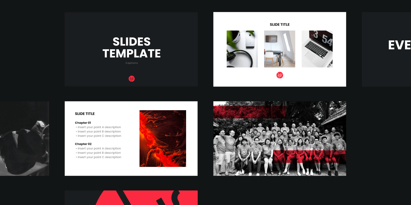
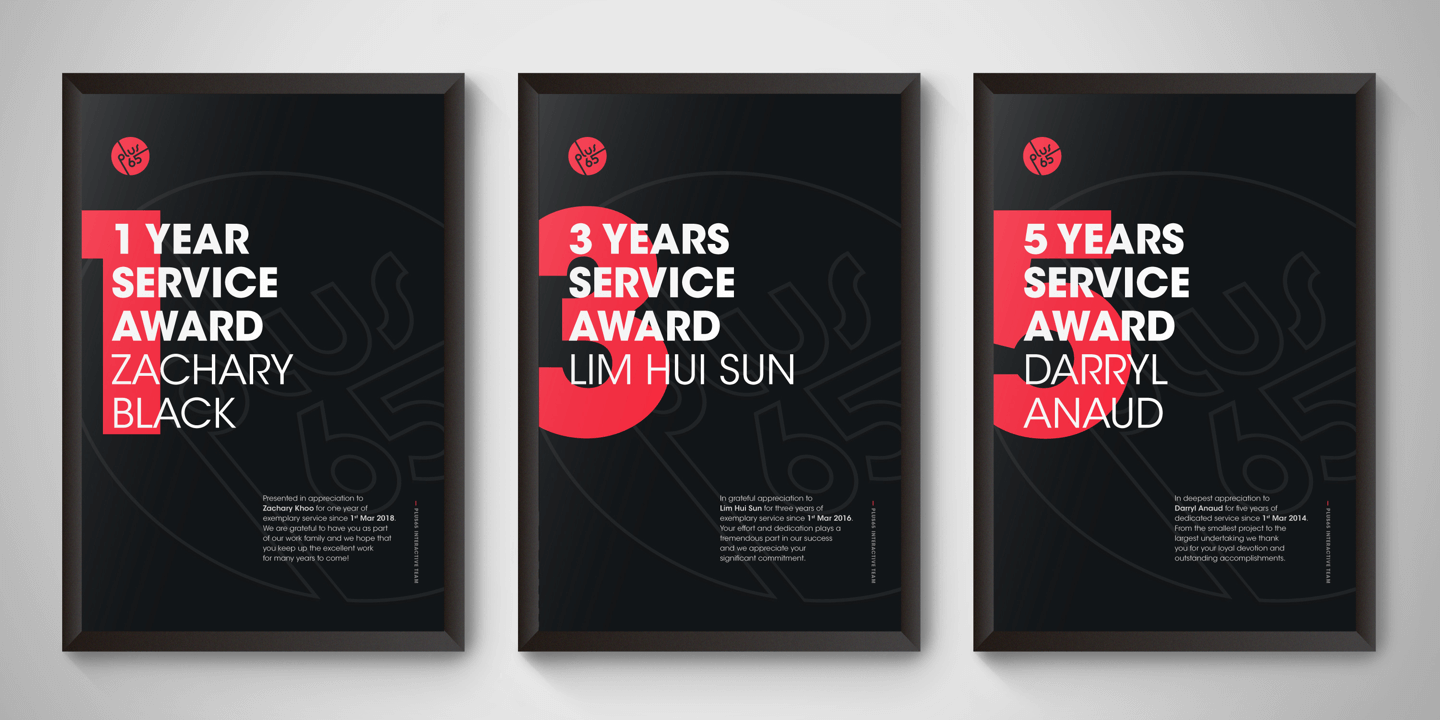
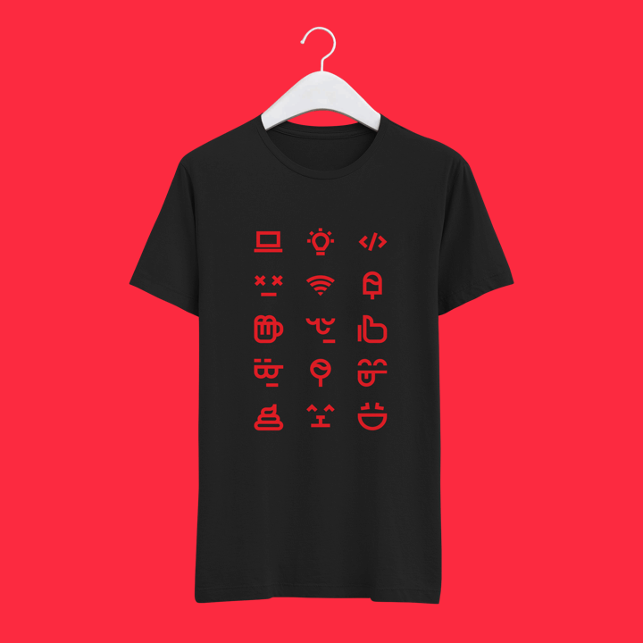
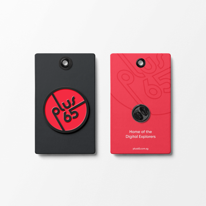
Brand Materials
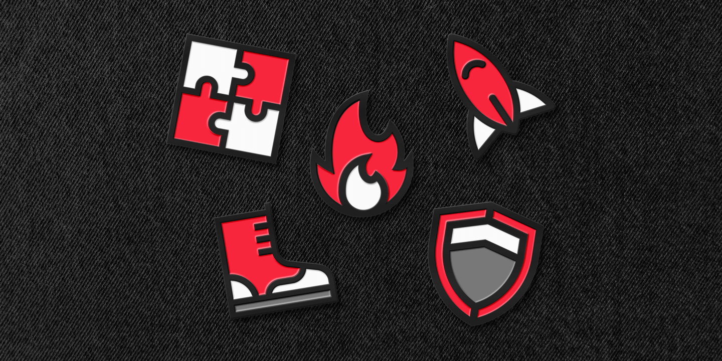
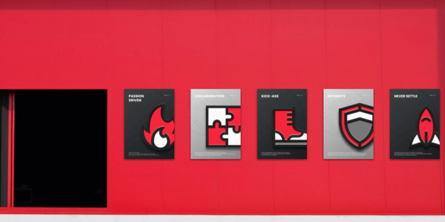
The success of the identity comes not from the logo alone, but from the application across multiple brand touchpoints. Presentation slides, service award certification, recognition badges, core values posters, and more materials had to be created. We decided to go dark & classy in all cases.