The logistic company that goes the extra mile for new markets
Shipping via Digital Innovation
Hop Express began as a modest set up in June 2018, with operations based in the land of smiles, Thailand, and is currently headquartered in Bangkok. It was launched by a team of passionate individuals with extensive experience in the logistics and e-commerce industries, driven by the values it was established upon. We are supported by our partners based in Singapore with strong expertise in IT and blockchain developments.
-
Client
Hop Express -
Our Role
+ Branding & Logo Design + Competitor Research & Analysis + User Experience Design + Information Architecture + CMS Integration + Web Design & Development + Customised Solution
-
Industry
Logistic -
Technology
+ GatsbyJS + Wordpress (Website) + Laravel (Web Portal)

Challenges
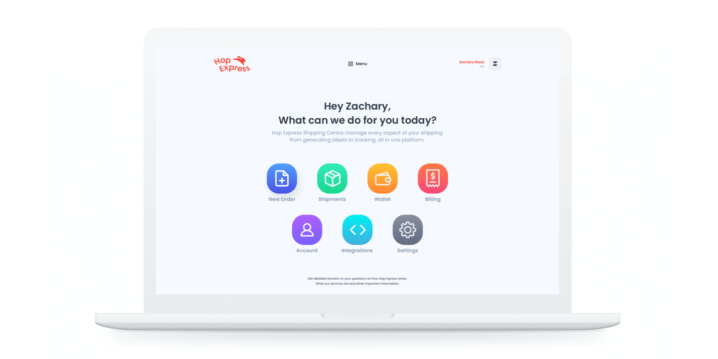
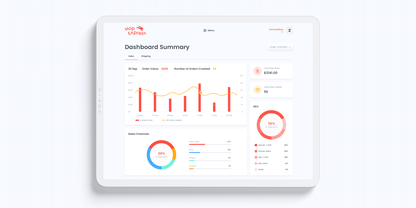
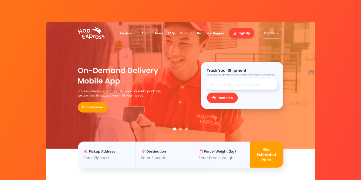
We're tasked to redesign their service to make it more intuitive, user-friendly, and modern-looking. The project encompassed the creation of end-to-end designs for the key pages, such as shipment type, carrier selection, shipping estimate, shipment tracking, and so on.

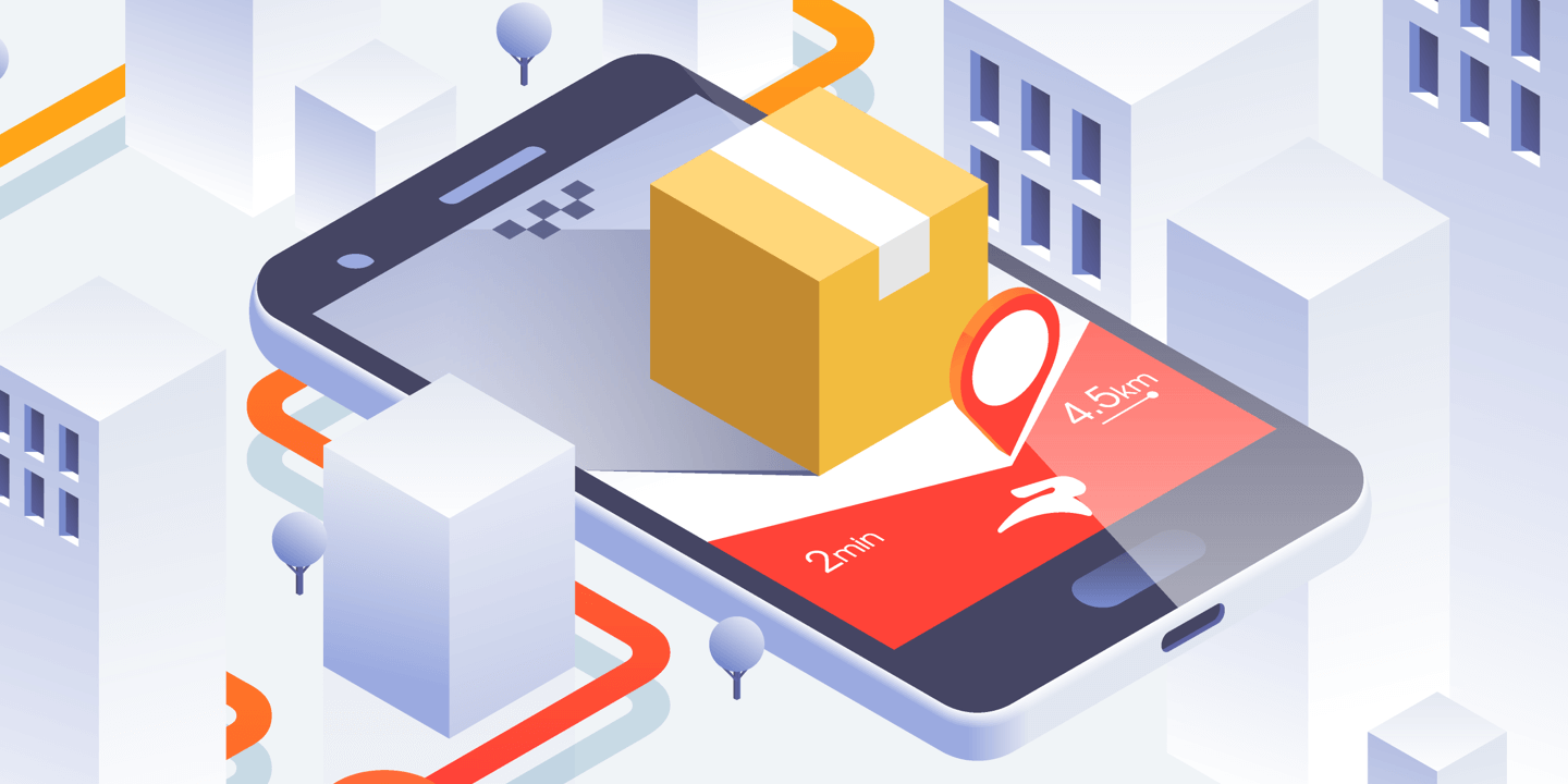
You don’t need a lot of different logistic services if you have one at your fingertips.
Mobility is everything. There are always times when you urgently need to respond or check on the status. All design decisions must be prepared with scalability in mind. The entire system is ready for all modern devices: mobile, tablets & a wide range of desktop resolutions.
Branding
With the evolution of a company, it is normal for it to drastically change its communication and identity to keep up with new market trends. Research and diagnosis led us to the path presented here: Simple information, quick perception, quality, efficiency, agility, and modernity.


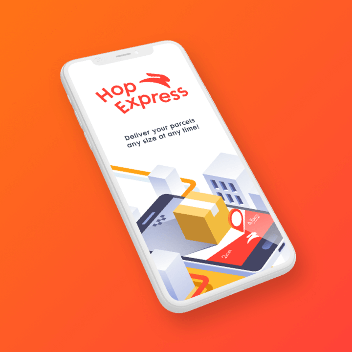
Logo Design
Hop Express is a name from two words: Hop (bouncing leap) and Express (delivery). We have 2 reasons for choosing the rabbit: The symbolism that is part of the common repertoire (fast & intelligent animal) and is also associated with hopping. With that, the rabbit was adopted as a symbol of the brand, but with a modern representation, to align itself with all the promise of the brand built.
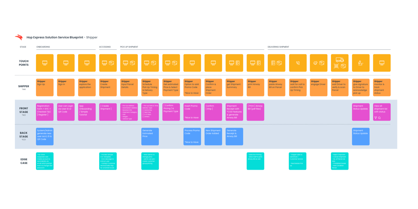
Service Blueprint
We visualized the relationships between different service components — people, props (physical or digital evidence), and processes — that are directly tied to touchpoints in each of the specific customer journeys.
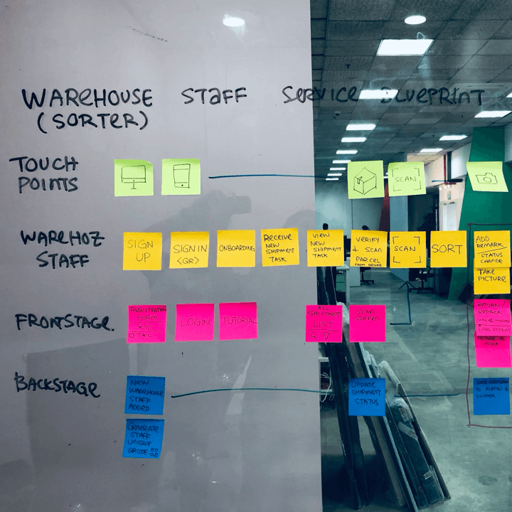
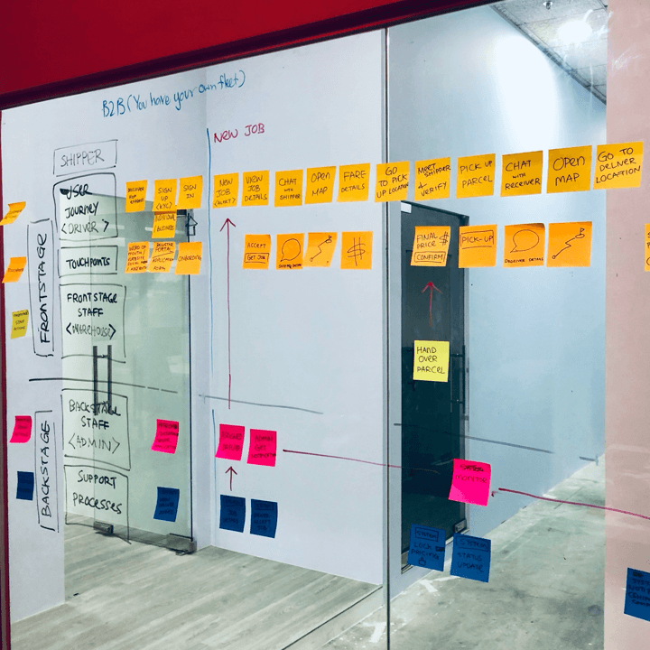
While this map is a living document, it changes and evolves as the company adds products or services, makes improvements and fixes problems. The service blueprint brought all the stakeholders on the same page and helped the company identify the pain points that needed to be fixed, opportunities for cost savings by automating initial customer installations, carrier automation and more, highlighted the moments that are loved by customers and partners that shouldn't be lost.