The right path to grow & maintain wealth across generations
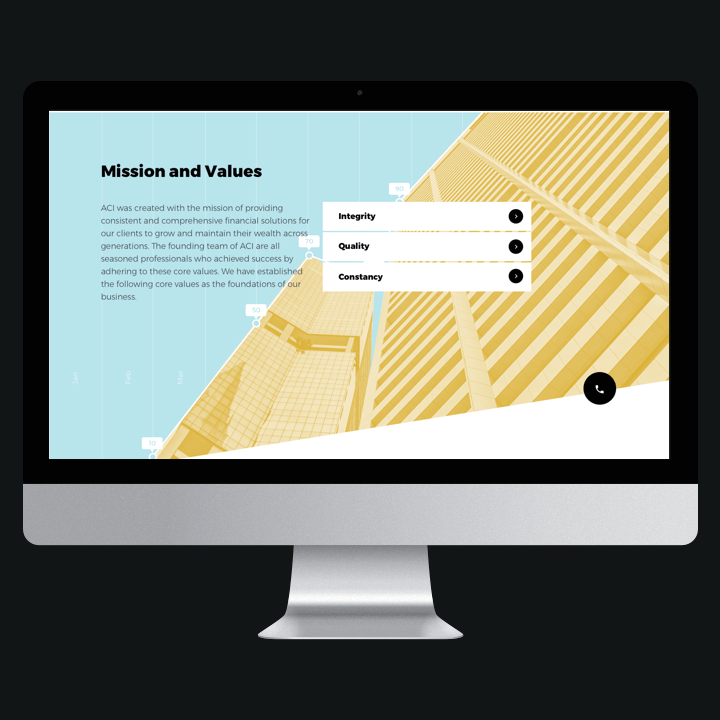
Integrity, Quality, Trustworthiness
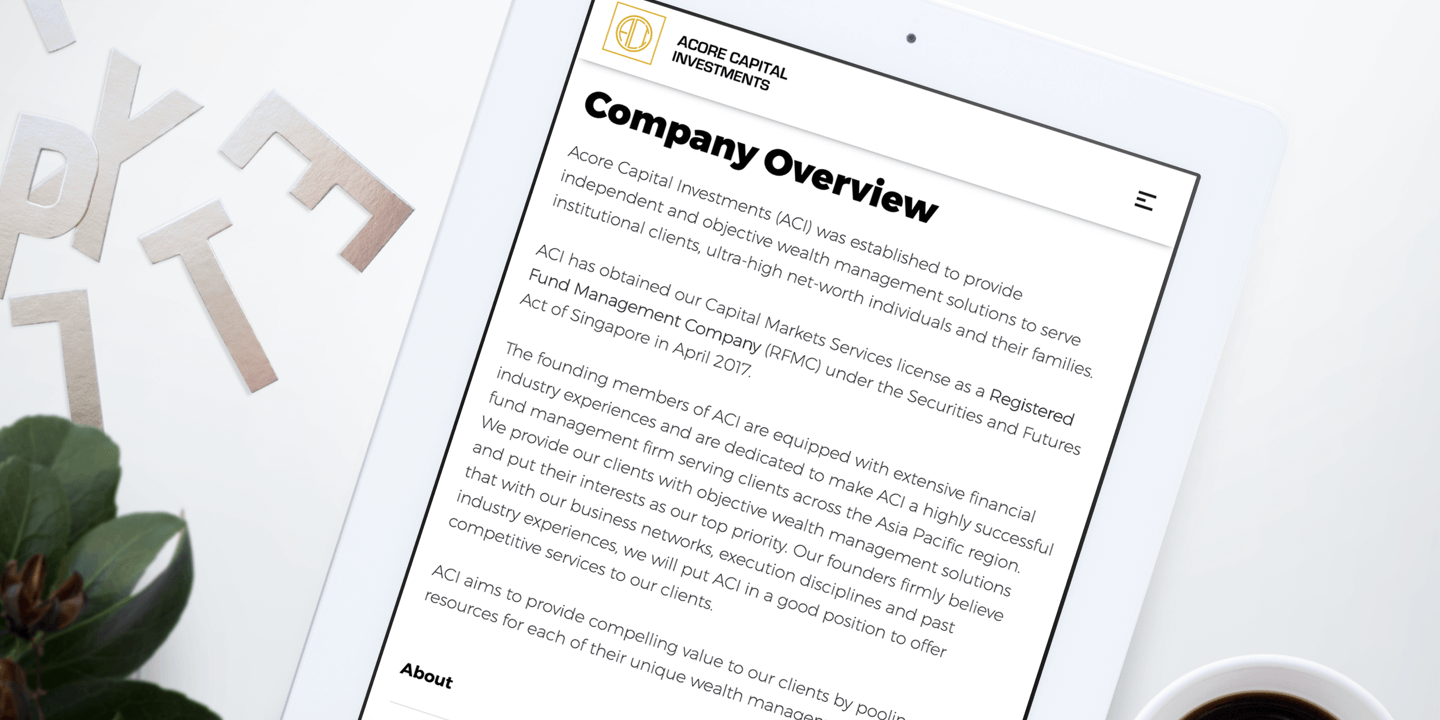
Established to provide independent and objective wealth management solutions to serve institutional clients, ultra-high-net-worth individuals and their families, Acore Capital Investments (ACI) provides their clients with objective wealth management solutions & put their interests as their top priority.
ACI aims to provide compelling value to its clients by pooling relevant resources for each of their unique wealth management requirements.
-
Client
Acore Capital Invesments (ACI) -
Our Role
+ Corporate Identity + Design & Visual Direction + Website
-
Industry
Finance -
Technology
+ Wordpress -
URL
acorecap.com.sg
Challenges
To come up with a corporate identity and marketing website that gives a modern, professional, and trustworthy vibe for the brand.


Research
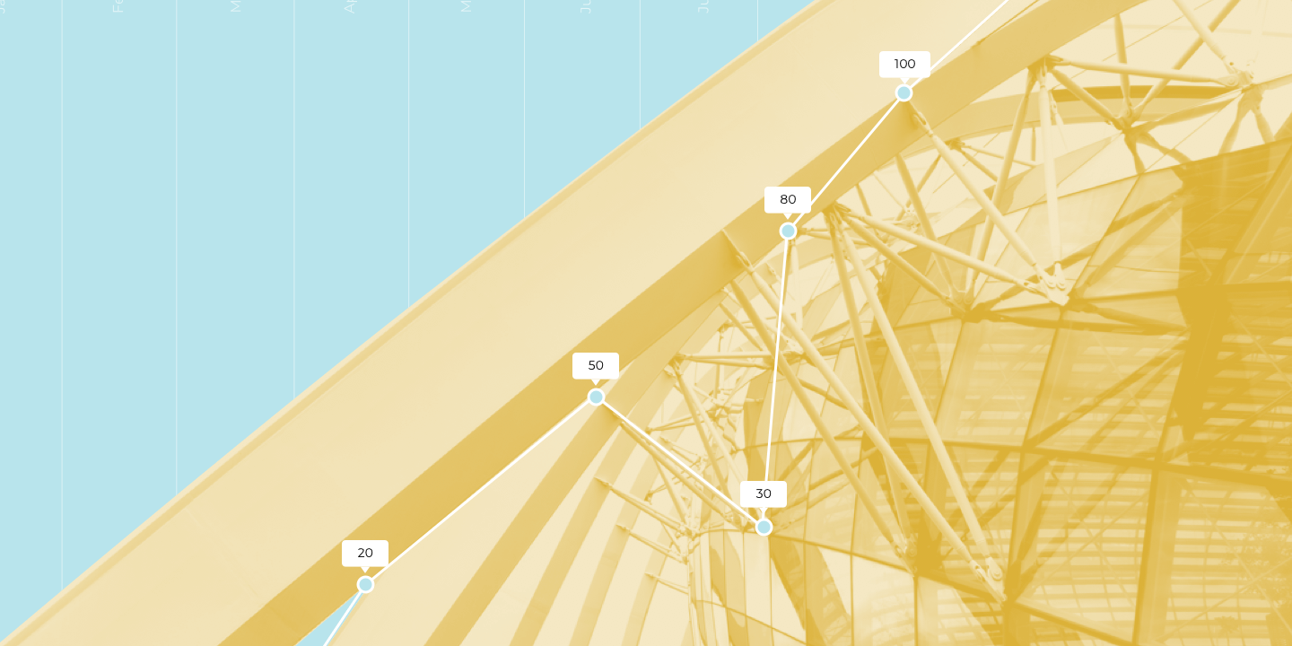
To create a true and accurate corporate identity, quick general research is done for existing financial websites and the elements they use are observed. The most common elements we see are charts, hardware, and architectures.
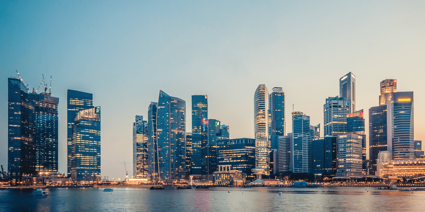
Modern Singapore Architecture
+
Financial Graph & Charts

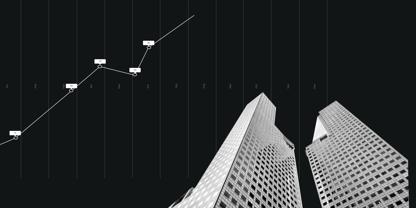
Lines, Blocks, Asymmetrical
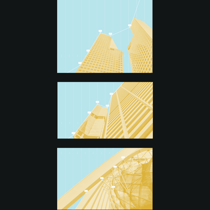
With the concept in mind, we start to identify the elements which can be integrated together to create images with lasting impression for the website. These images exhibit professionalism, progression and efficiency to convince the target audience and build trust in our client.
We explored different variations of the graphic images we created, keeping things modernistic at the same time.
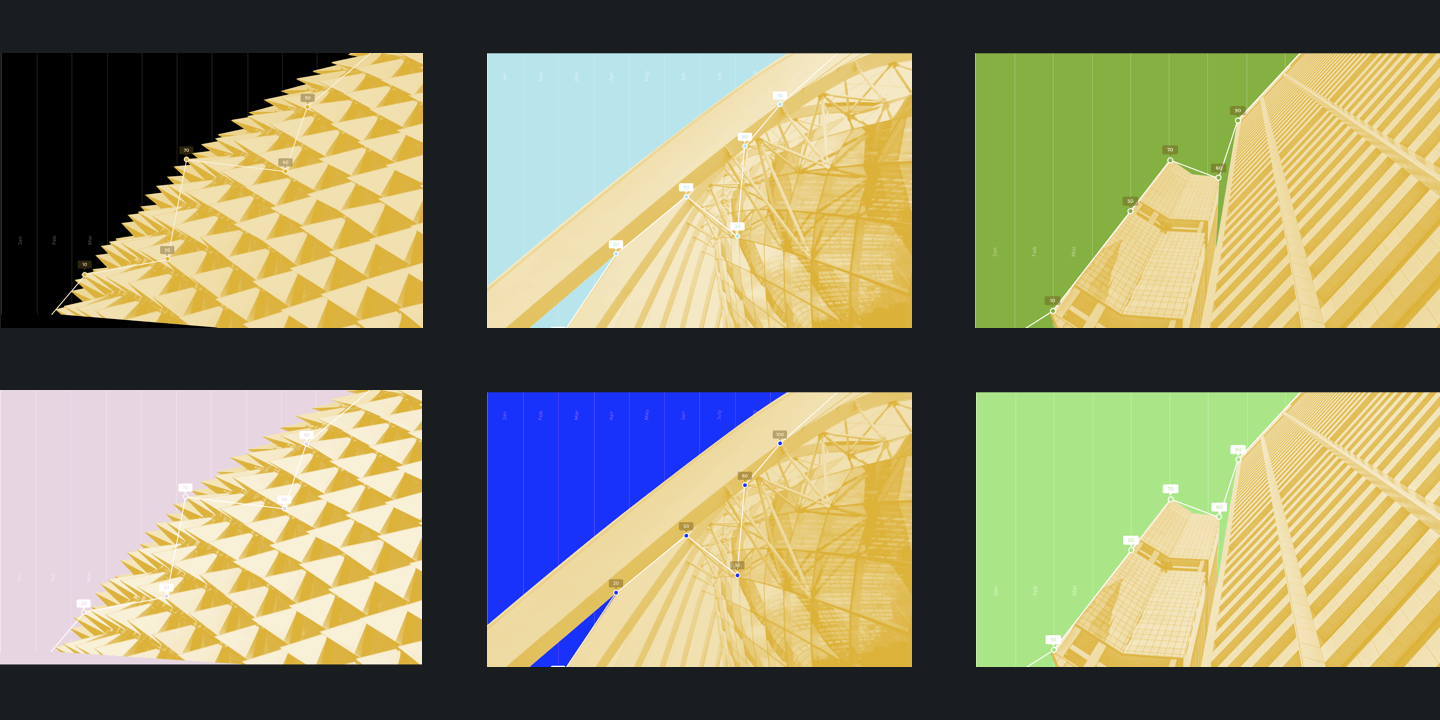
Colours
To make the corporate identity stand out from other usual finance websites, our team decided to explore a unique array of colours around the primary colour Gold which was chosen for its common association with finance.
Colours explored were green, blue, pink, and black. Green is traditionally related to growth and nature while blue reflects on trust and stability. Pink symbolized a good financial position while black represents professionalism.
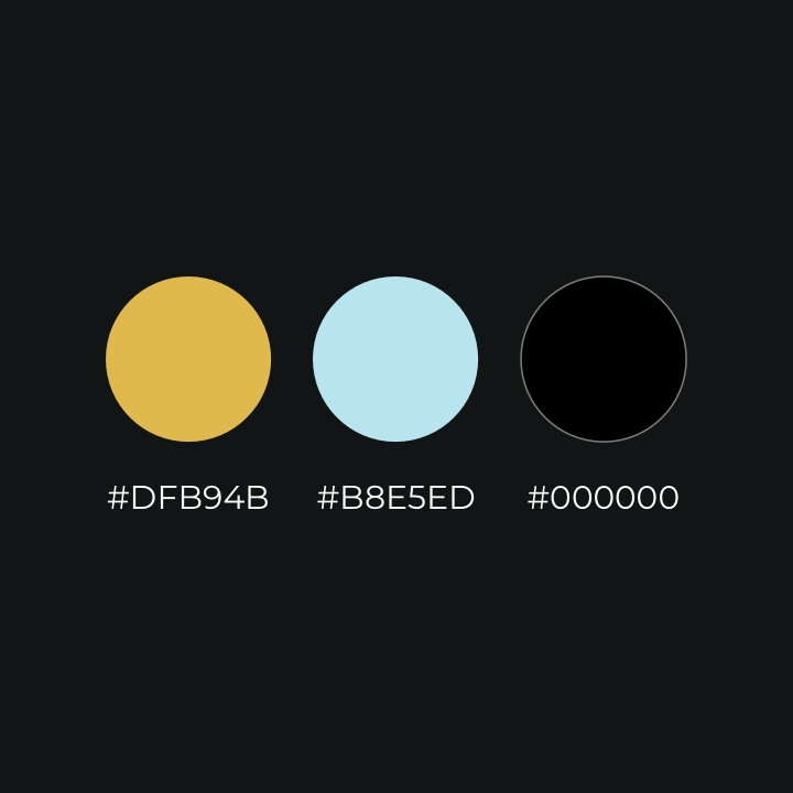
Style Guide
The light blue version was selected eventually for its unique colour and its compatibility with gold. The text is in black for better readability.
Graphic Design
The team proceeded to compute a few images using building facades and processed them with reference to the style guide.
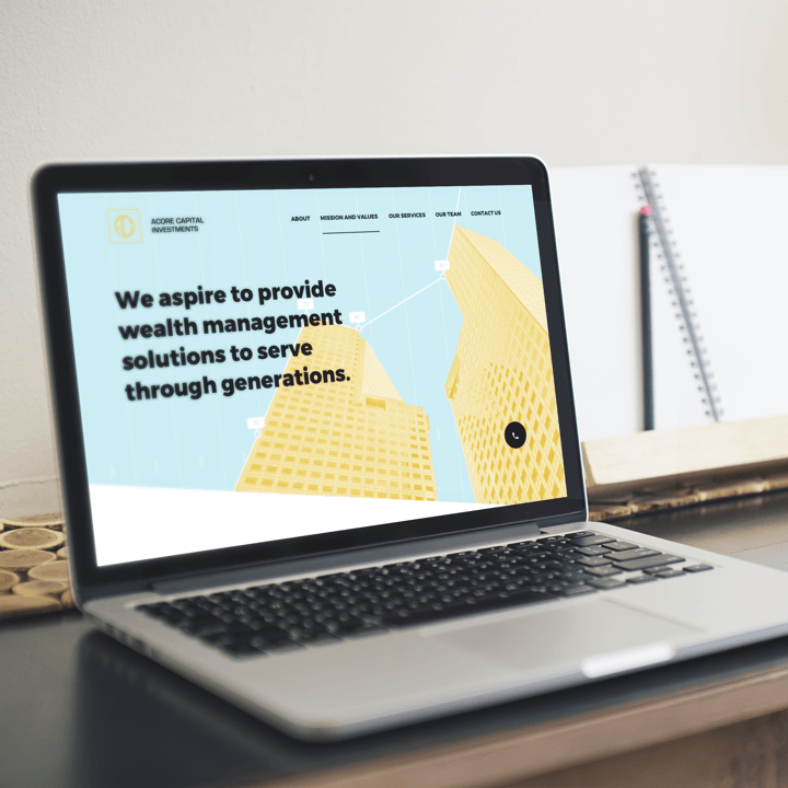
Website Design
With the clever play of asymmetry and simple line works, the website now highlights the elements of modern architectures while the visual guidance of the website is enhanced for the audience.
Outcome
When everything is put together, the overall website looks interestingly unconventional with a hint of minimalism and professionalism as compared with other professional finance websites out there.